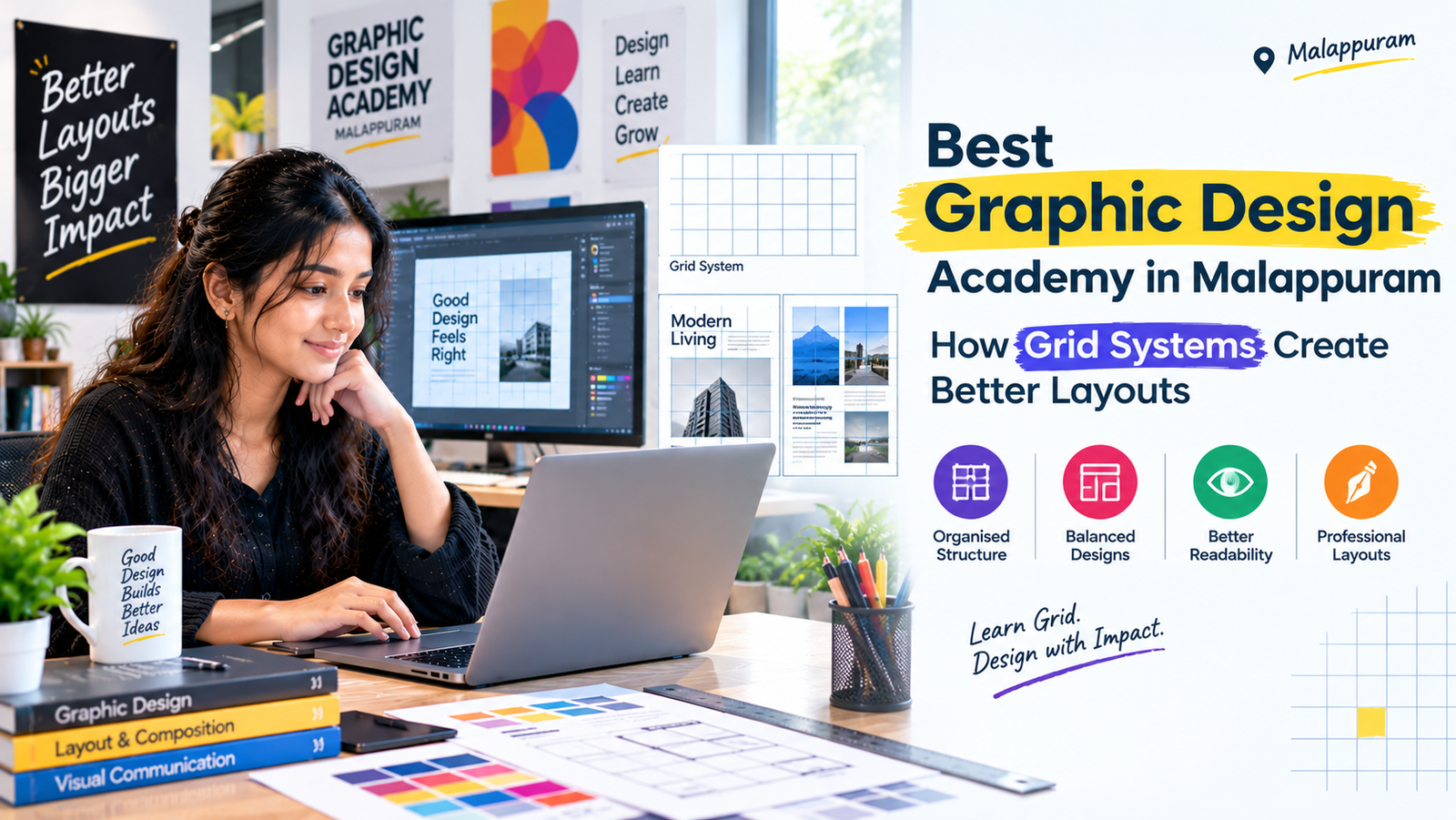
Have you ever noticed how a magazine page, website, or brochure can look organised even when it contains several different elements? One reason is the use of grid systems.
A grid provides an underlying structure that helps designers position text, images, and other elements in a balanced and consistent way.
What Is a Grid System?
A grid system divides a design area into columns, rows, margins, and spaces. Designers use this structure to align elements and establish relationships between different parts of a layout.
For example, a magazine spread might use multiple columns for body text and a wider area for a photograph. A social media design might use a simple grid to align a headline, supporting text, and an image.
The grid does not have to be visible in the finished design. Its purpose is to provide structure while allowing creative flexibility.
Why Grids Improve Visual Communication
Without a clear structure, design elements can appear randomly placed. A grid helps maintain alignment, creates consistency, and makes information easier to scan.
It is particularly useful when creating multiple designs for the same brand. A consistent layout system can help social media posts, brochures, and promotional materials feel connected without making them identical.
However, grids are not strict rules that every design must follow. Designers can intentionally break the grid when doing so supports the message or creates a useful visual effect.
Learn Layout Design Through Practice
If you are searching for the Best Graphic Design Academy in Malappuram, look for a learning environment that teaches design fundamentals alongside practical software skills.
At Ash Academy, learners can work towards developing their creative abilities and applying design principles to different visual projects.
Choosing the Best Graphic Design Academy in Malappuram also means considering whether the programme encourages experimentation, feedback, and hands-on practice with different design formats.
A strong layout does more than make a design look neat. It helps viewers understand information, follow the intended visual flow, and focus on what matters most.