

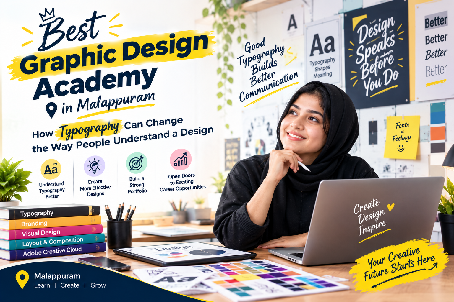
Sometimes, two posters contain exactly the same information, yet one feels clear and professional while the other looks confusing. The difference may not be the colours, images, or amount of information. It could simply be the way the text is arranged.
Typography plays a major role in how people read, understand, and respond to visual content. For aspiring designers searching for the best graphic design academy in Malappuram, learning to work with typography is an important step towards creating effective designs.
Typography Is More Than Choosing a Font
Typography involves much more than selecting a font that looks attractive. It includes decisions about size, spacing, alignment, weight, and the relationship between different text elements.
These decisions influence how information is presented and how easily the viewer can understand it.
For example, a promotional poster might contain a headline, a short description, a date, and contact details. If every element is displayed in the same size and weight, the viewer may struggle to identify what matters most.
Good typography creates a clear visual order.
Why Visual Hierarchy Matters
Visual hierarchy helps guide the viewer’s attention from the most important information to the supporting details.
A designer might use a bold headline to communicate the main message, smaller text for additional information, and a contrasting style for a call to action.
The objective is not to make every element stand out. It is to help the viewer understand the message in the right order.
This becomes especially important when designing advertisements, event posters, social media creatives, brochures, and promotional materials.
Choosing Fonts With a Purpose
Different typefaces can communicate different feelings. A clean sans-serif font may suit a modern technology brand, while a more traditional serif typeface may work well for a publication or an editorial design.
However, font selection should also consider readability, audience, brand identity, and the medium in which the design will appear.
Using too many typefaces or combining styles without a clear reason can make a design feel inconsistent.
Learning when to experiment and when to keep things simple is part of developing a designer’s judgement.
Can Typography Be Learned?
Absolutely. Although some people have a natural interest in visual design, typography is a skill that improves through observation, practice, and feedback.
Beginners can practise by redesigning existing posters, comparing different font combinations, studying spacing, and experimenting with text hierarchy.
When looking for the best graphic design academy in Malappuram, students should consider whether the training covers design fundamentals alongside software tools.
At Ash Academy, graphic design training focuses on developing practical design skills that learners can apply to creative projects and professional work.
Small Design Decisions Make a Big Difference
A successful design does not always need complicated illustrations or elaborate effects. Sometimes, the right font, balanced spacing, and a clear hierarchy are enough to make a message more effective.
For aspiring designers, understanding typography provides a foundation for creating visuals that are not only attractive but also easy to understand.
The more thoughtfully a designer uses text, the more effectively they can communicate ideas through design.


